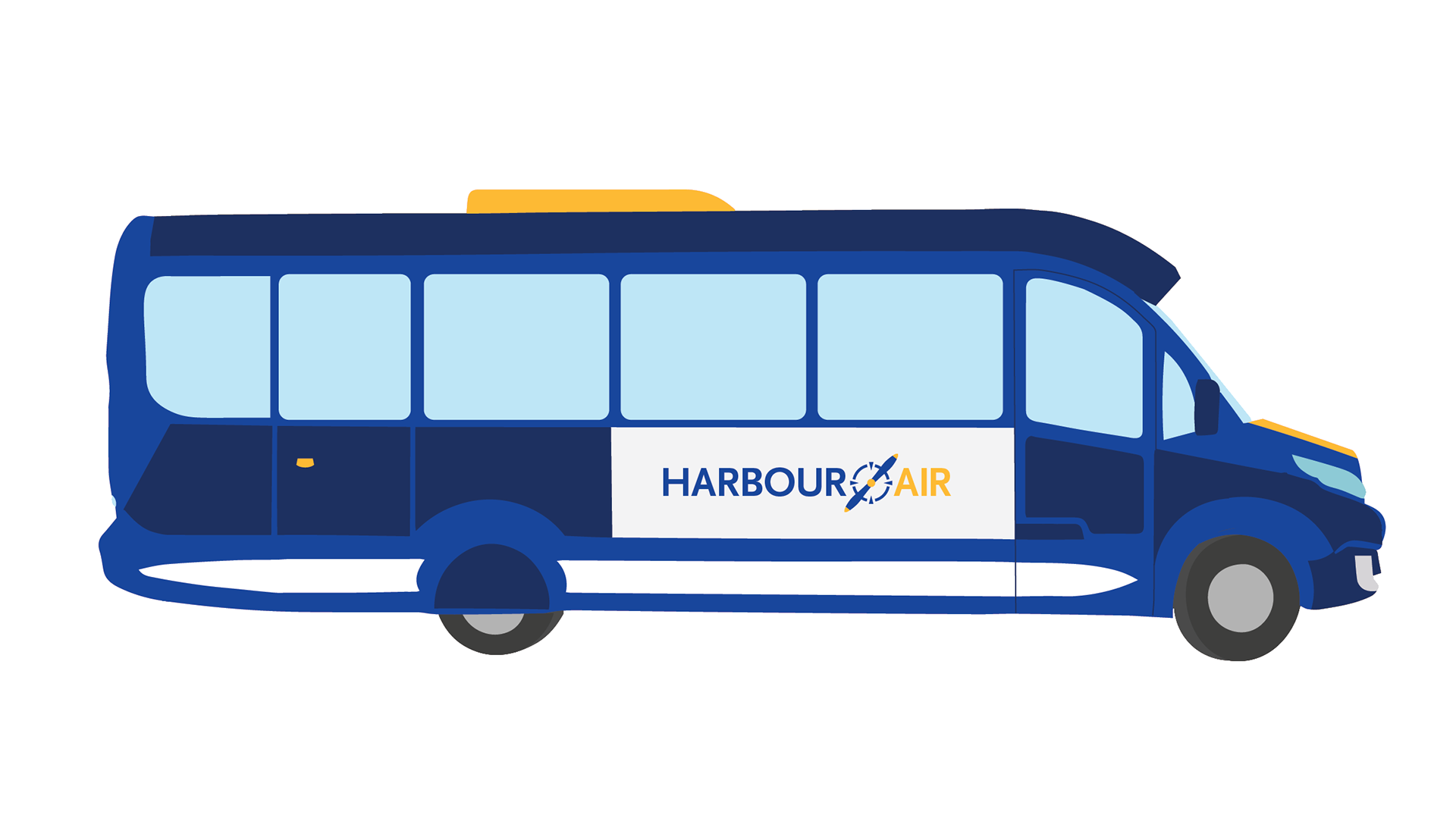
This projects prompt was the rebranding of Harbour Air. The companies current branding is outdated and subpar compared to its size. Therefore, the projects focused on updating and modernizing the brand and all its related pieces. The final pieces were assembled into a brand standards document.
Old Logo
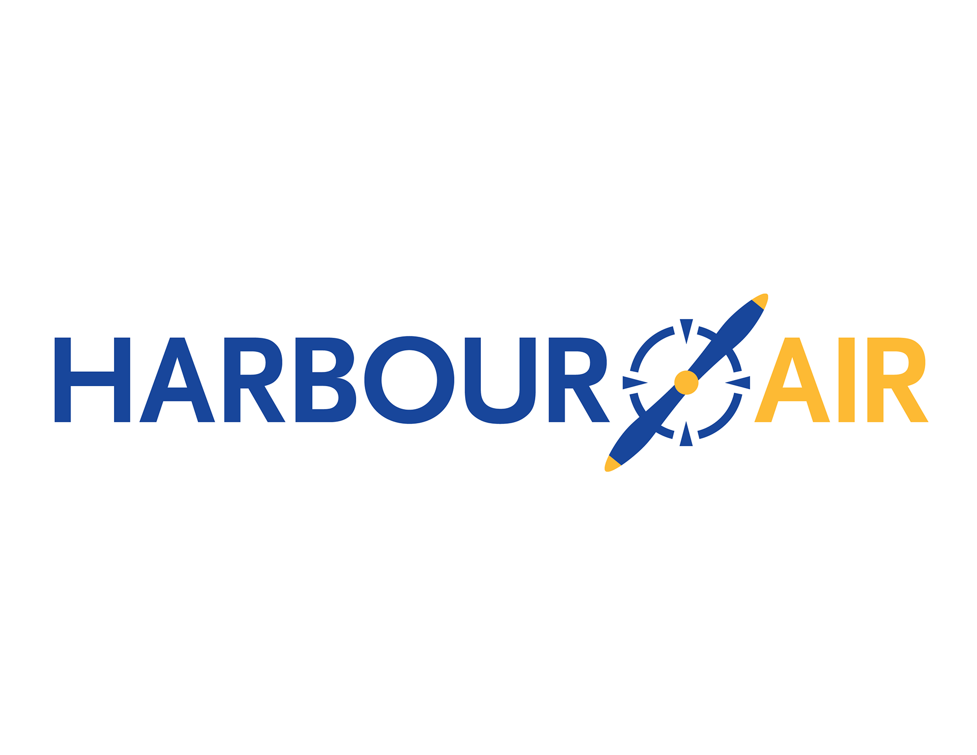
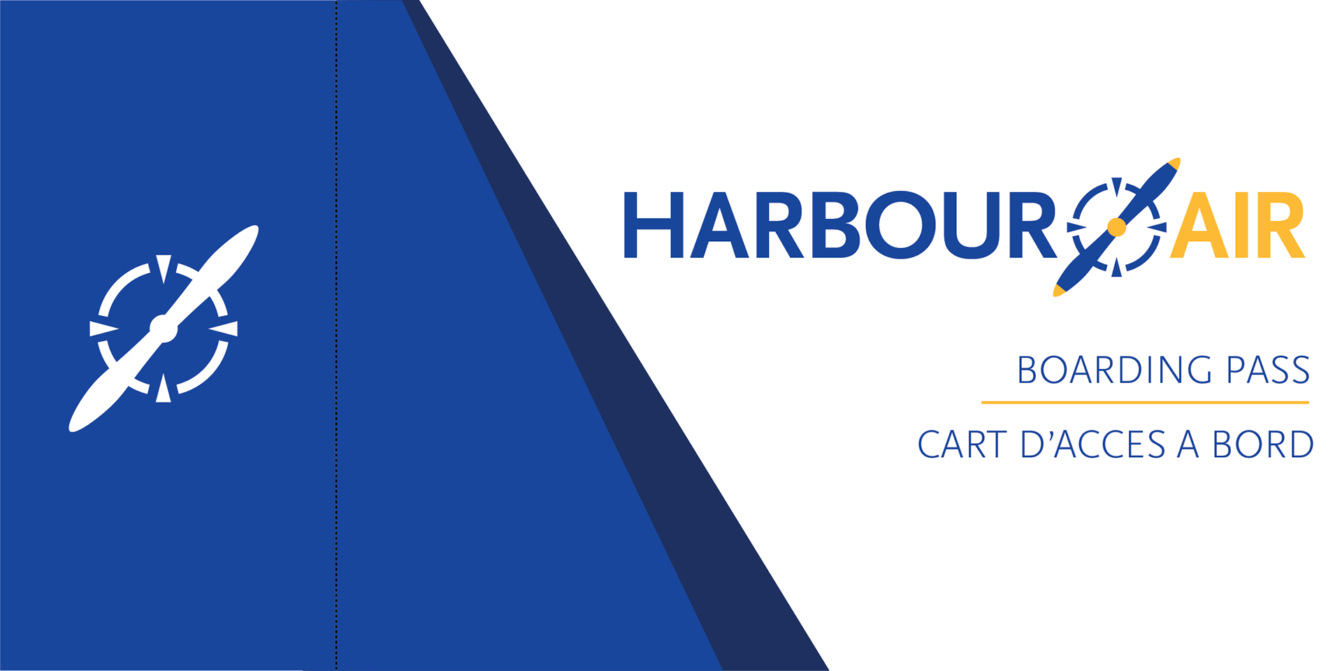
New Logo
I knew that the brand itself, if subpar, was recognizable. I utilized this in my redesign. So, although I would change much of the imagery used with the brand, I kept the colours similar. I wanted the brand to look professional and modern, and convey a feeling of safety, comfort, excitement and fun. As well as being similar to the existing brand colours, the blues represent calm and comfort, while the yellow the excitement and joy. I settled on a more corporate, minimal appearance for the overall brand; fitting for their status as the largest sea plane company in North America. On that same point, I mainly kept to using yellow as a minor part of the overall brand. Overusing the yellow lead to amateur feeling.
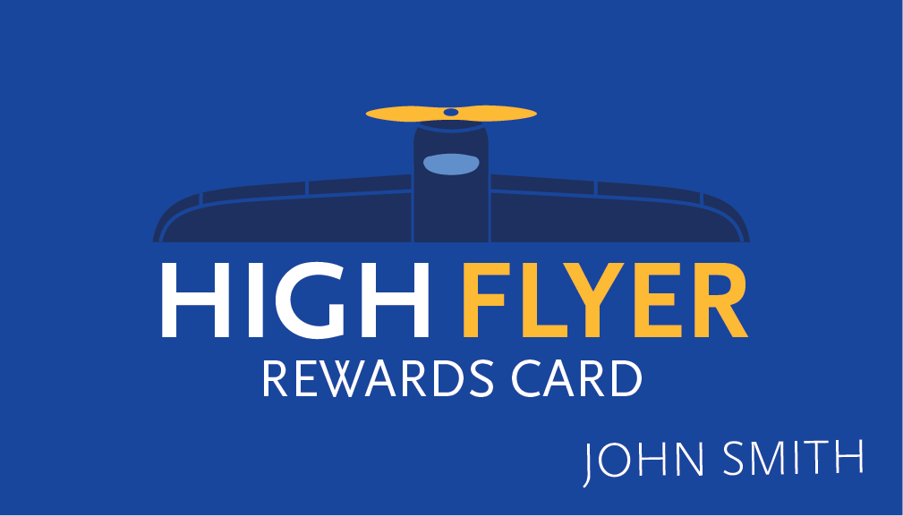
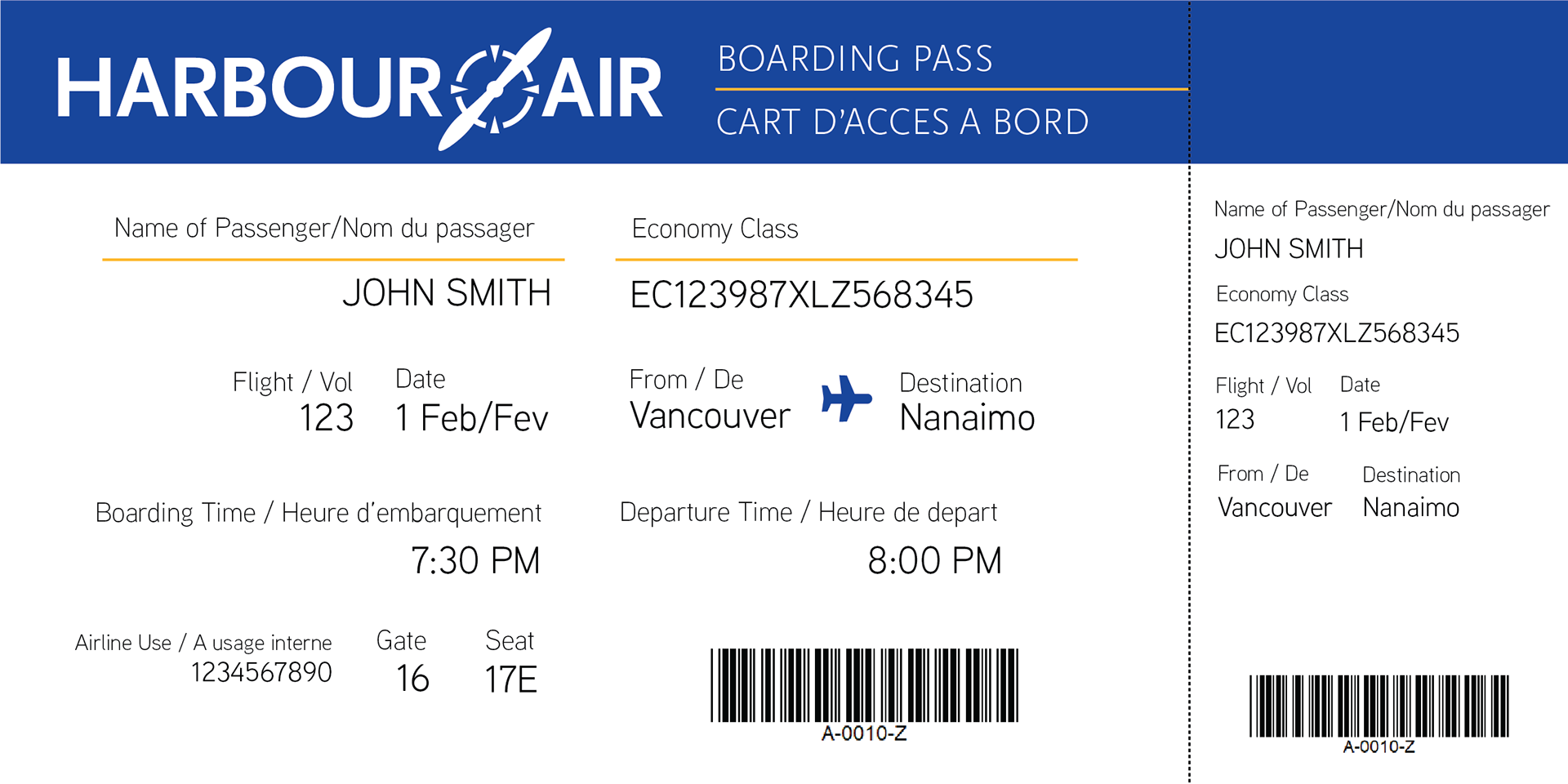
I mainly used Illustrator to design all these pieces. First, I created the logo, starting with rounds of thumbs on paper. I moved to Illustrator and revamped the logo in black and white, before finalizing its colours. Then, I listed out the major elements that would need rebranding. These include their vehicle decals, reward program cards, and boarding passes.

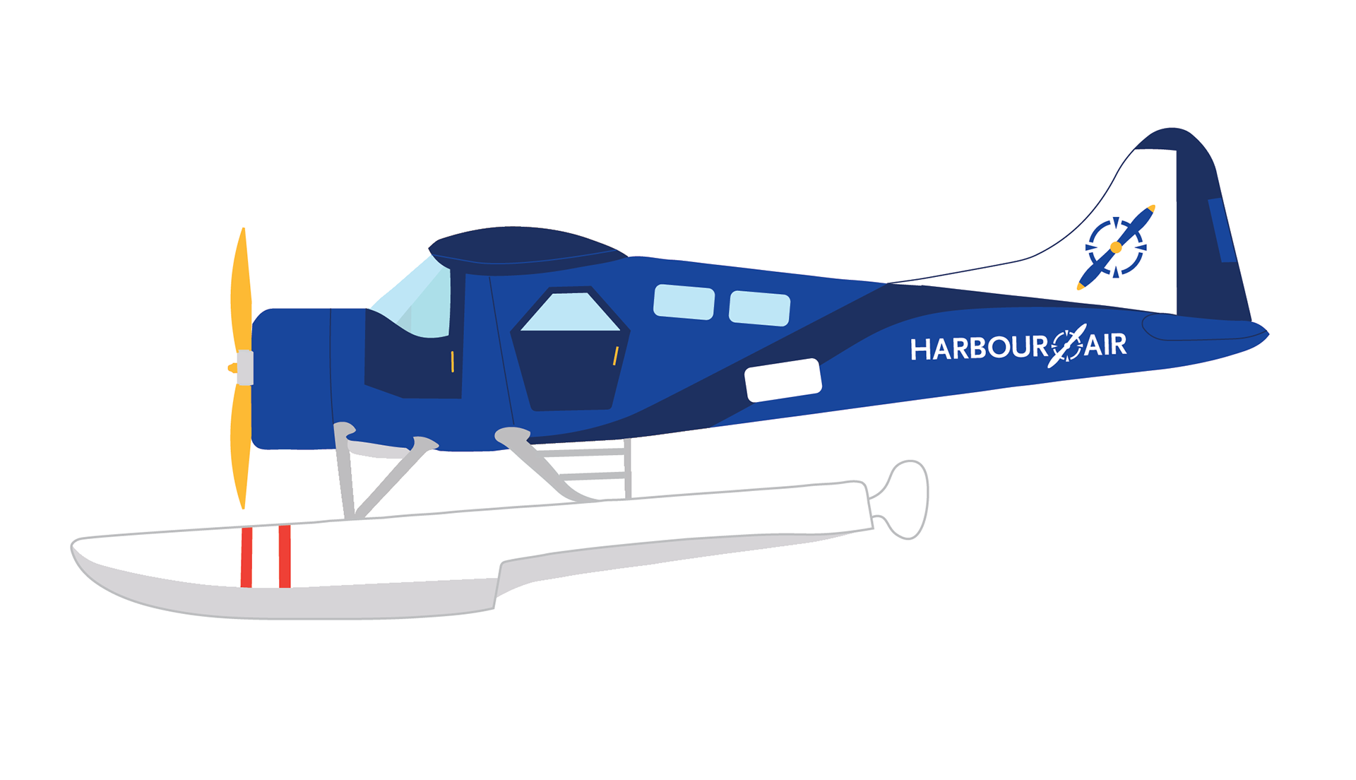
DHC-2 de Havilland Beaver